In the competitive world of eCommerce, not all shopping carts are created equal; your checkout flow can make or break an online sale.
Zeemo has created this 10 Point Checkout Checklist to avoid common pitfalls that can lead to cart abandonment and keep your customers motivated to complete their purchases.
1
Ensure Your Digital
Door Is Open
As with a brick and mortar store, if a customer arrives on your virtual doorstep only to find a barrier to entry, most will leave.
So, don't require registration upfront to shop.
There is a false idea in e-commerce marketing that forcing visitors to sign up before showing them your wares creates commitment; it doesn't; it creates resentment.
A forced sign-up form is a barrier; they are akin to a pushy virtual salesperson hanging a 'no window shoppers allowed' sign. You want visitors to your site to feel welcomed, invited to browse freely without feeling obligated or pressured.
.webp)
Leave any form filling until after items have been added to their cart so as not to put potential customers off before they voluntarily commit to doing business with you.
2
Have No Stock
Surprises
As with all stores, there are times when stock isn't available; however, your customer shouldn't get to the end of the checkout only to find out an item is out of stock. Displaying whether something is available early on in a product search allows your customer to manage their expectations and potentially select a substitute.
If you wait until your potential customer has passed through several steps only to find they can't buy an item right away; you create a sense of resentment.
3
Make 'Add To Cart'
Obvious
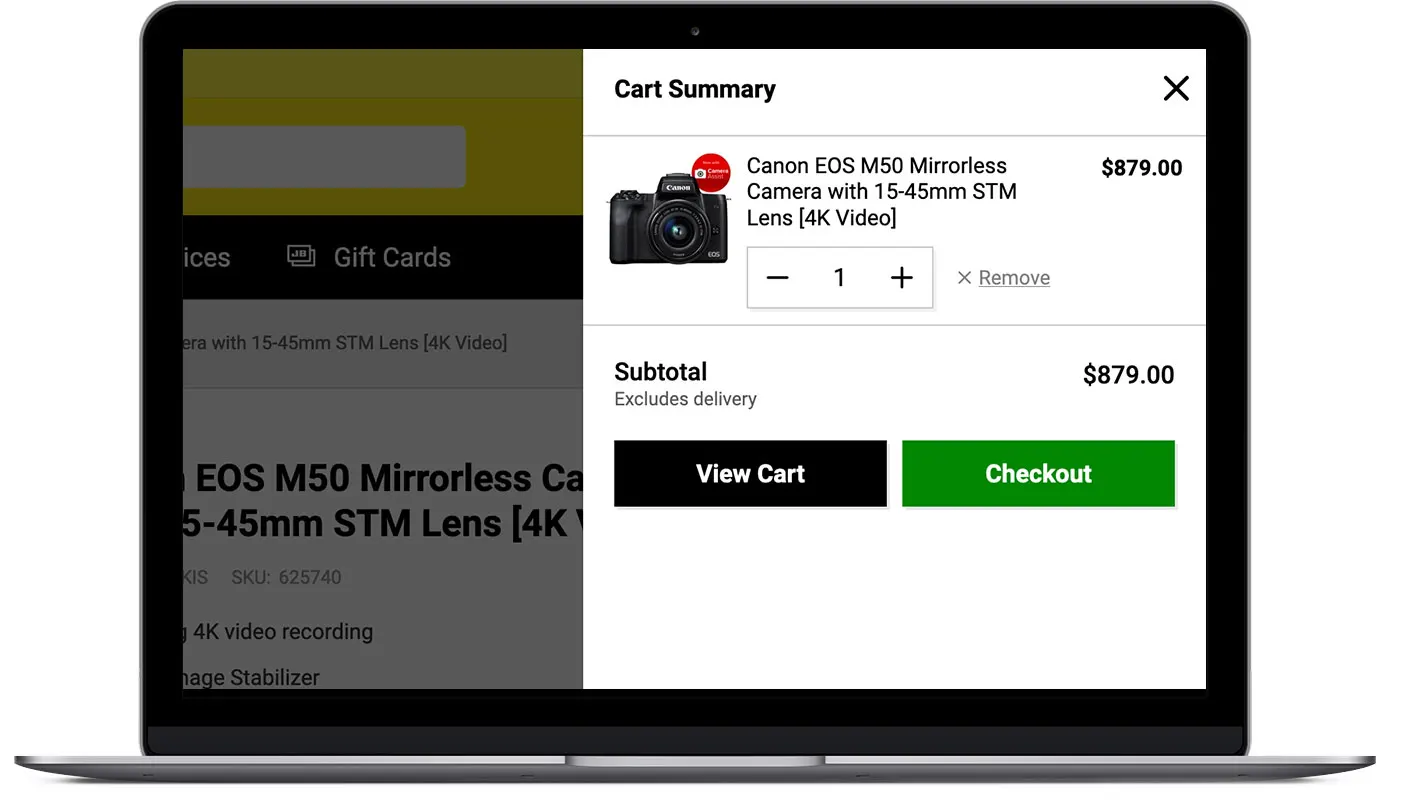
When a visitor to your site adds something to the cart, they're no longer browsing—they're shopping.
Just as with a physical shopping basket or trolley, they should be able to see when they add to their cart and have clear confirmation.
Many sites only display a tiny top right cart icon with items counter or, as this example from Chemist Warehouse, they may indicate the running cart value. These tiny animations or small confirmation texts are hard to notice.
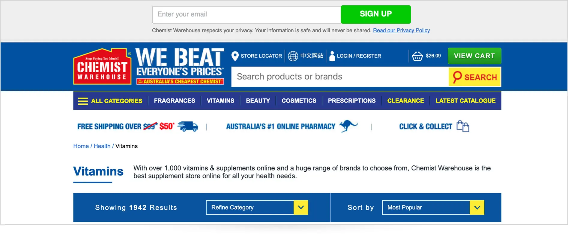
A well designed "Add to Cart" function should include a small animation to offer a subtle visual cue that the buyer has made an action toward a purchase.
The animation may result in a brief display of the cart contents, then fold in after a few seconds to encourage further shopping.
4
Modifying Orders
Should Be Simple
When shopping your customers may mistakenly put the wrong goods into their basket, or change their mind, or wish to change sizes.
By offering simple controls to modify items within the cart, you provide flexibility and functionality to make it easier for your potential customers during the checkout process.
Using a 'remove item' button rather than requiring modifying an added item to zero amount, is a more intuitive way to delete an unwanted product from a cart.
5
Offer Virtual
Assistance
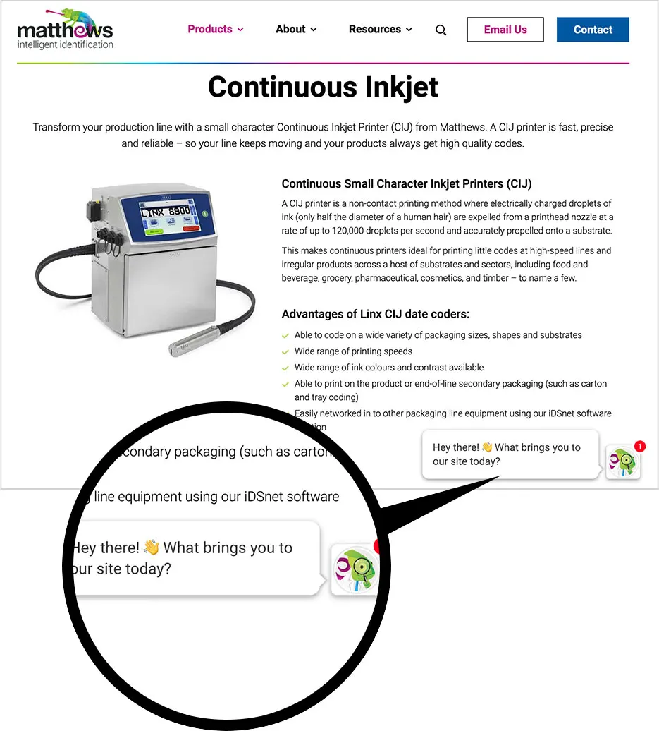
Unlike an instore shopping experience when buying online, your customers need to make their item selections, then manage the input and processing of their order and payment, themselves.
There will be times when shoppers on your site may experience a problem or have a question.
Your online store is open 24/7, though you may have a 'contact us' form or email displayed, if a potential customer can't access real-time support, you run the risk of uncertainty leading to them cancelling the checkout process.
Therefore, it is crucial that you make it simple and straightforward for your buyers to find the answers they need to proceed with confidence.
These days many CRM E-Commerce website builders provide the option of a virtual assistant chatbot plugin that can offer immediate answers to FAQs.
Taking the time to craft excellent clear responses to as many customer questions or concerns you can think of and utilising a help chat facility can dramatically improve consumer confidence and reduce cart abandonment.
.webp)
BonusTips
Provide A Progress
Indicator
Zeemo's creative writing team are experts in trust-building brand storytelling, contact us to discuss how we can help create a powerful brand story that will connect with your customers.
6
Turning Back Shouldn't
Mean Starting Over
Some online stores treat their customers like the proverbial snake in the bamboo, once they enter the checkout process, there is only one way out, and that is forward.
Your customer, however, may want to head back to reread a product description or continue browsing your store, so it is important that you have a prominent "back" button.
The back button should lead to the previous page the user was on without error, and any data the user has entered thus far should still be displayed when they return to the checkout to save them from having to reenter it.
The frustration and time wasted, discovering a form once filled has reset, and is now blank after clicking a back button, is enough to make some customers leave without making a purchase.
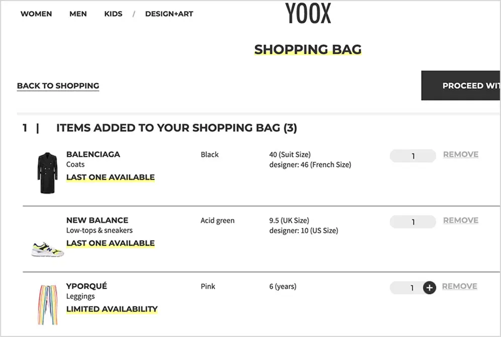
7
Step One: Cart
Review
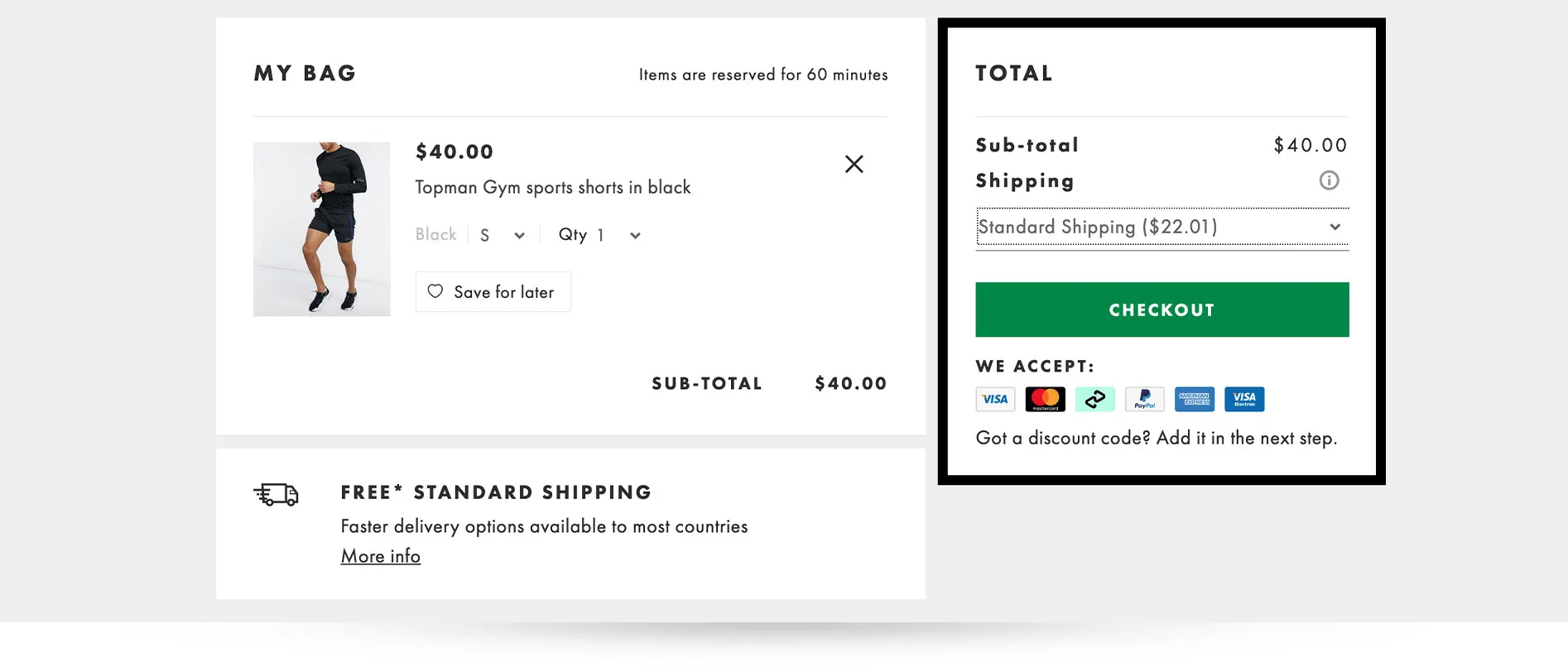
Before completing their purchase, your customers will need to review the items in their basket to ensure they have everything they came to buy.
Ideally, you will include a thumbnail of the main product image, any custom specifications fields they need to enter, such as colour, quantity, size; and have a link to the product's main details page.
The cart review stage offers an opportunity to present products likely to result in an impulse sale and increase cart value.
However, if you are going to include any product recommendations during this stage of the checkout process, be sure to delineate them so as not confuse your customer.
If you don't have a smart stock algorithm on the backend to customise recommendations based on cart contents, select your three most popular products and display them with the label 'Best Sellers,' or three 'On Sale' items.
8
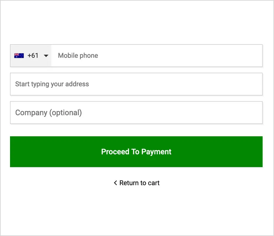
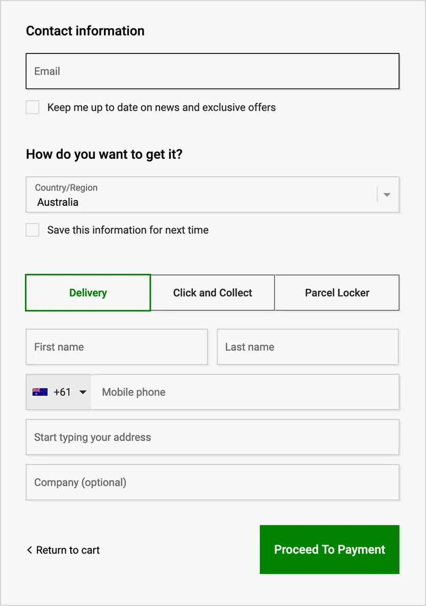
Step Two: Entering Checkout
Account Details
After reviewing the cart and clicking the 'Checkout' button, your customer is no longer shopping - they are now purchasing.
Therefore it is vital that beyond this point, you keep the checkout interface simple and free of distraction. Eliminate any unnecessary browsing elements, such as recommendations, top products and latest offers.
That said, you should still offer a small "return to shopping" button, or text link, just in case the customer forgot something.
Clearly label the mandatory data fields required to create their account and shipping information.
Avoid asking for too many personal details, gender and age are useful pieces of marketing intelligence, but they should be entirely voluntary and optional.
If asking for gender details, be sure to include at least one option for your non-binary customers, such as 'neither' or 'other'.
Ensure all buttons that progress to the next step are large and prominently placed.
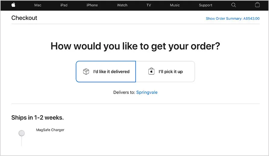
9
Step Three: Selecting Shipping
Options and Coupons
Online shopping behavioural studies show that this is the critical stage, in the checkout process, where carts are most likely to be abandoned.
Shipping costs, options and speed and how you manage discounts such as coupon codes, are incredibly influential in shoppers online purchasing decisions.
Another issue found to put customers off is when there are too many, or too complex, shipping options; or when the most affordable option means delayed delivery.
For optimum customer retention at checkout, you should offer a maximum of three shipping options:
- Fast & Free Shipping with $X Value
- Click & Collect
- A reasonable rate Express Delivery for when a cart value doesn't reach the free shipping minimum.
There are several shipping fulfilment and dispatch services in the market that offer competitive fixed postal rates that you can factor into your product prices to offer free shipping when orders exceed your cart value minimum.
The other issue lies in how you manage your promotional discounts.
If prior to paying, your customer encounters a large prominent "coupon" field, they immediately know that a discount is possible, so what do they do? Why they leave your site and go searching for a coupon of course!
If they can't instantly find one that works, they face a decision to keep looking or pay what they now perceive as 'too much'.
If possible, you don't want to take a user out of the checkout process, because once out they may not return.
If you have promotional campaigns using coupons, consider using customised links to automatically add a discount to the cart to track the origin of a lead instead.
If that isn't an option instead of a big obvious coupon field, use a discrete small text link, along the lines of "do you have a promotional code?" that opens a pop-up page.
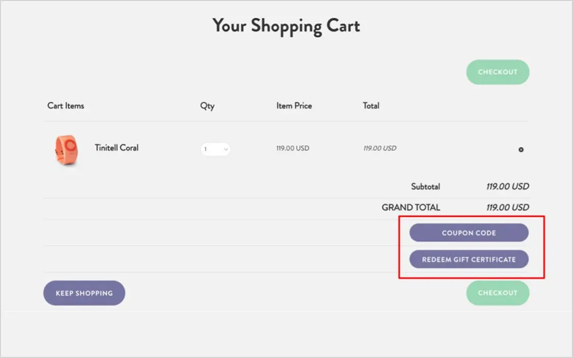
Make it obvious where they can find a code, for example: "Did one of our podcast partners send you? Tell us which one to receive 10% off!". This will inform their search and establish the size of potential discount they could get if they bother looking.
In addition, if you are going to use coupons always provide an alternative on-page action, that the user can take to get a discount directly, such as signing up to your newsletter.
10
Step Four: Payment and
Order Confirmation
In this final stage of the checkout process, but for a customer to complete this step, they need to trust your site with their payment details.
Therefore your payment page will require a Secure Sockets Layer (SSL) certificate. SSL technology encrypts sensitive information and ensures your customer's data is secure.
Fetching a credit card is a hassle, remove it by including at least one one-click online payment options such as PayPal or Stripe; be sure that you have the correct settings to ensure your customer returns to your site after payment.
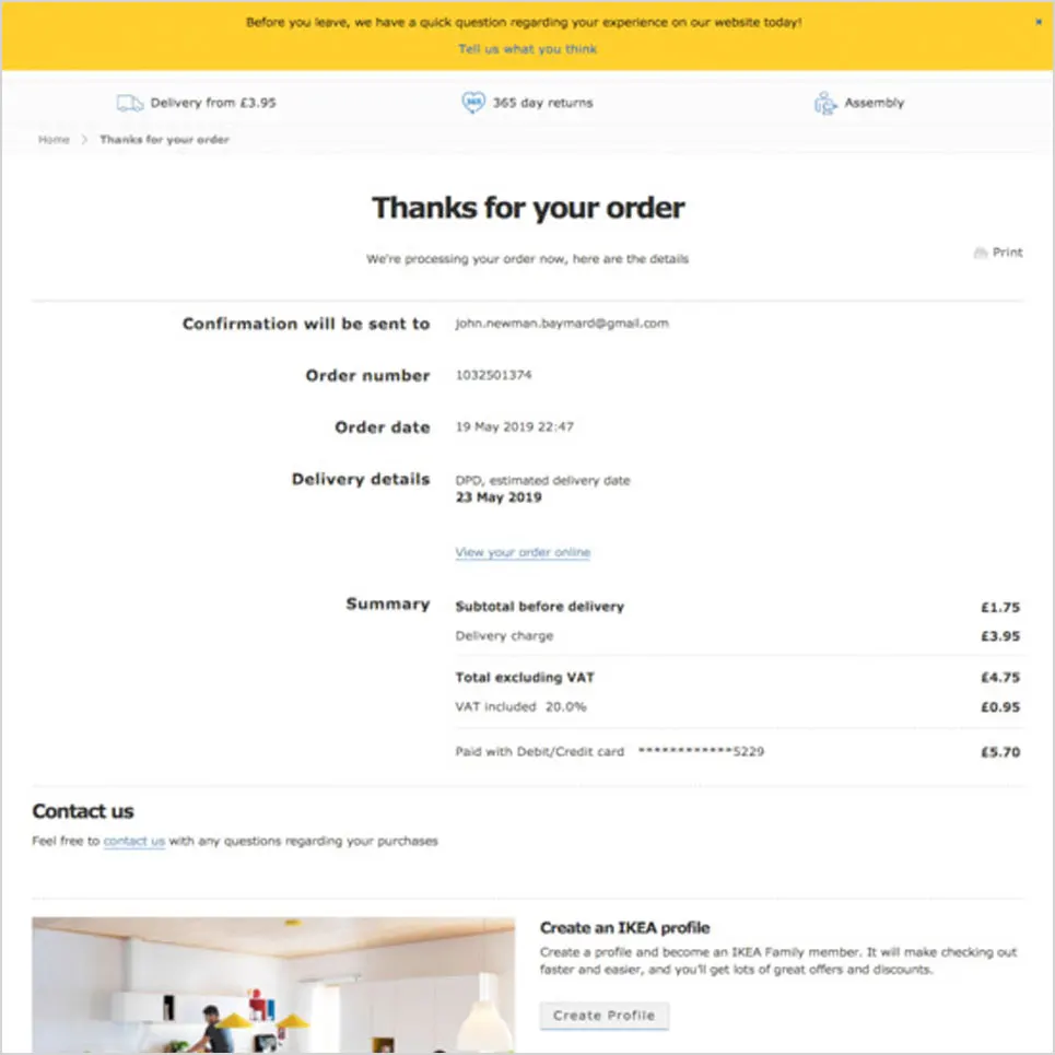
Once payment is processed, confirm and thank them immediately via a pop-up notice on your site, so they know they have completed the transaction.
Also, follow up with a confirmation email containing their order details, tax receipt and details of any tracking and expected delivery times.
Need Help?
The team at Zeemo are experts in building optimised checkout funnels for e-commerce sites.
Contact us to discuss how we can help your customers move smoothly through the online sales process and reduce the likelihood of cart abandonment.