
Natural Font Resizing
This is actually quite a simple trend, but one that has big impact. As the browser gets smaller, the size of the links do too – this ensures that they have enough room to breathe and aren’t squished up together. This technique is great if you only have 5 to 8 links in your menu.

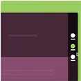
Vertically Elongated Menu
The wide horizontal menus of standard desktop websites don’t tend to work well with the narrower vertical screens of smartphones. One of the cleanest solutions is to realign the menu so that it’s vertical instead of horizontal. The size of the font can be increased to improve tapability.
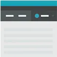
On-Screen Toggle
Some users do find toggles annoying, but it’s a great tactic for controlling navigation – particularly if you have a long list of menu items. Users simply click the ‘menu’ button and a list of pages that they can jump to drops down. Even better if the menu remains fixed as the user scrolls.

Hamburger Menu
Also known as the hidden toggle, this type of navigation sees the use of three horizontal lines that are clicked to open the menu (in the form of a sliding side menu) and is great for saving space. The content on the page is often darkened when the menu is opened to keep attention on the links.
Navigation Realignment
The navigation links are kept together and their position is realigned instead. This could be horizontal or vertical, it doesn’t matter providing the links fit and still make sense on all screen sizes. Some websites move the navigation from beside the logo into a block beneath it.
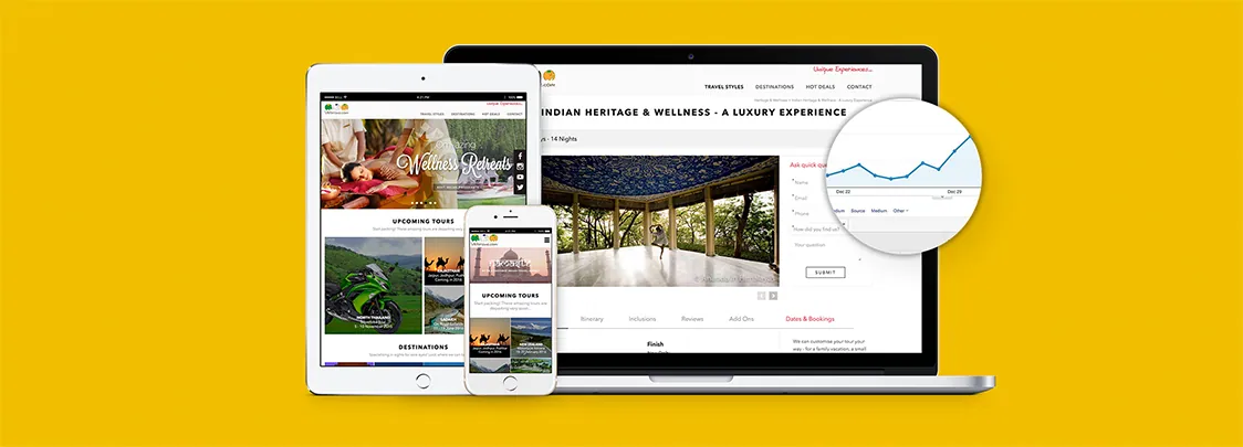
Is your current website responsive? If so, how does it handle navigation? Could there be a better way of displaying the navigation using one of the trends we have outlined above? Ensuring that your website has engaging navigation will go a long way to ensuring that users click through and explore.
All of this is moot, however, if you don't have a responsive website. Zeemo specialises in responsive web design and can ensure that your site looks attractive no matter what size screen it is viewed on. If you have yet to go responsive or want an upgrade, get in touch with us today!